High Fidelity Mockups
Project brief:
App users need a way to be able to virtually consult a doctor, as being in each other’s physical presence isn’t always possible for doctors and patients. Design an application to enable anyone, anywhere to instantly chat with a health expert. The app design is
simple and intuitive to use. The app is free to download and use but video calls through the platform required payment.
simple and intuitive to use. The app is free to download and use but video calls through the platform required payment.
Design Thinking:
Problem statement - Users need to feel confident about the quality and cost of health services provided through the app because trust in health services over the internet is low.
Hypothesis - I believe by clearly providing billing rates, credentials, and user ratings of doctors, users are more likely to partner in creating an enhanced user experience by signing up, building trust and feeling confident in the app.
Design Process:
1-Understand gaps I 2-Research I 3-Ideate I 4-Information Architecture I 5-Prototype I 6-Gain validity I 7-Design System I 8-Refine the designs
Design process explained:
1-Understand gaps
________________________________________________________
1-Understand gaps I 2-Research I 3-Ideate I 4-Information Architecture I 5-Prototype I 6-Gain validity I 7-Design System I 8-Refine the designs
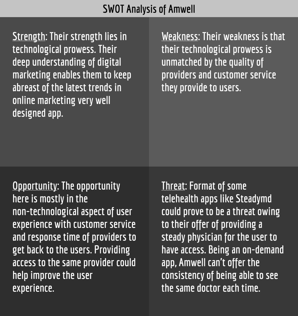
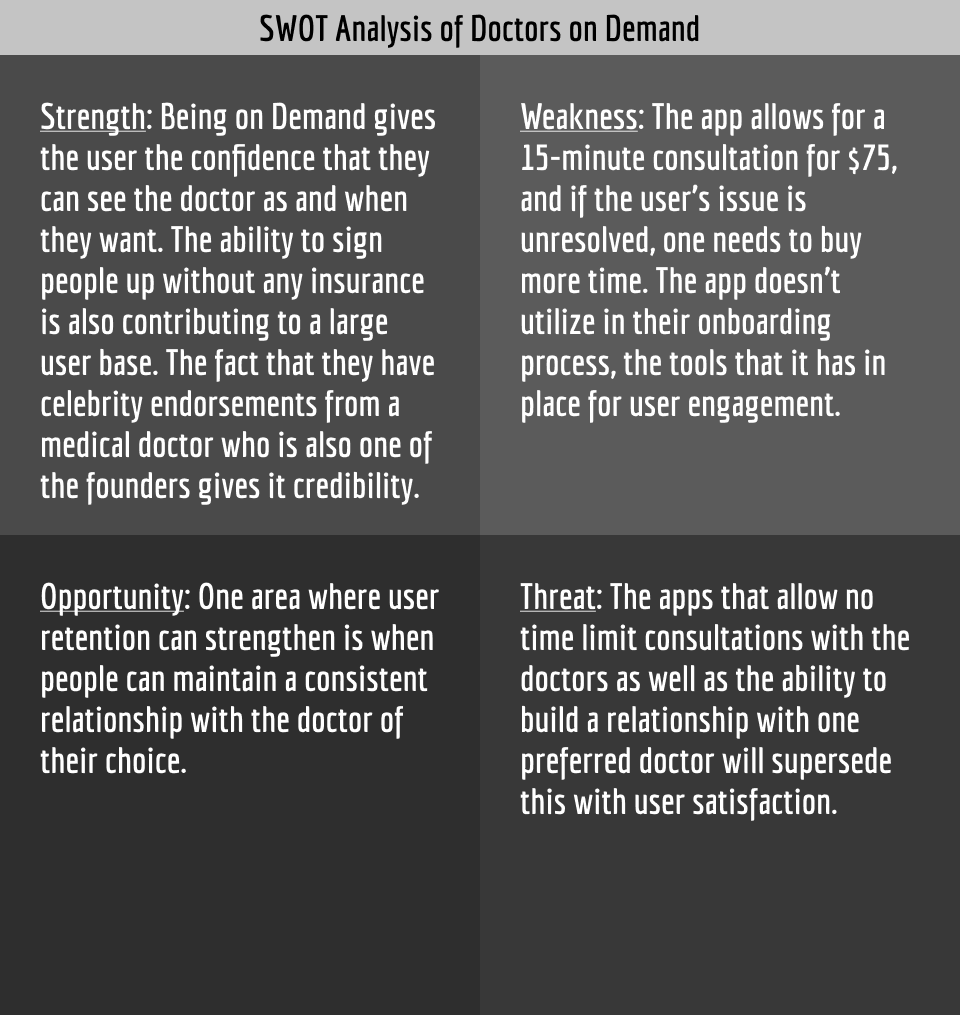
I conducted competitive analysis of apps that allow anyone, anywhere to instantly chat with an expert in the health industry. For this I picked Amwell and Doctors on Demand. Nielsen's usability heuristics were applied for a better understanding.
I also conducted competitor profiling that involved an overview of key objectives, market advantage, and overall strategy.
SWOT - Strength Weakness Opportunity Threat analysis
The competitive analysis, SWOT analysis and Business Requirement Documentation helped me create high level user stories:
Understanding the gaps through secondary research provided these learnings.
Users are concerned about the following:
Trust - Is the user getting a trained expert in the field they claim.
Technical - Connectivity issues might cause interruptions or delays.
Customer care - Are there policies in place for complaints.
Accountability - Will prescriptions be sent to the pharmacies in a timely way.
Misdiagnosis - As the visit is virtual there is a higher possibility of error in diagnosis.
Design process explained:
2-Research
________________________________________________________
1-Understand gaps I 2-Research I 3-Ideate I 4-Information Architecture I 5-Prototype I 6-Gain validity I 7-Design System I 8-Refine the designs
My primary research began with thirteen participants answering my questions on a survey.
Primary Research goals
-Understand the demographics of the users that would use a tele-health app
-Get the users opinion on competitor expert apps/websites
-Understand the motivation of the users
-Understand the pain points of the users
Key insights and themes emerged from the user surveys as seen below.
User interviews were conducted with three participants.
Research goals:
-How do users establish trust in the app
-Are technical issues with connectivity a factor for users
-What level of customer care do users want
User interview analysis can be seen in the 8 slides below.
Design process explained:
3-Ideate
________________________________________________________
1-Understand gaps I 2-Research I 3-Ideate I 4-Information Architecture I 5-Prototype I 6-Gain validity I 7-Design System I 8-Refine the designs
With the high level user stories and the research gathered after conducting user interviews I created user personas, user flows and journey maps of the users with successful entry points and exits points to complete specific tasks.
User personas created can be seen in the two slides below.
User Journey maps.
- As users complete tasks on the journey map, they go through phases, each phase is accompanied with a thought, and an emotion and presents an opportunity for the UX design process.
- Empathy with the user's emotional stages can help identify and understand the delight and pain points for the user. This helps in identifying how to influence user behavior, which is critical.
- Journey maps allow for understanding the real problem, which in turn helps defining the features that can address these pain points most critical to cause an impact and clearly define success.
- Evolving the journey map with every design change and test results should be a continual process. This is because the evolution of the user directly affects the journey map.
User Journey maps and User Flows slides
Key feature requirements highlighted because of journey maps:
- The format of the app has to be that there are many providers available on demand so users are not waiting for an appointment to see someone
- Set up pricing, payment plans to be very affordable for people who do not have insurance.
- Ensure providers catering to a wider age range are on the list of available providers, with various skills.
- Include prescription renewal features for the elderly.
- Ensure that the option exists for users to select their preferred provider so that users can maintain a relationship and feel more comfortable
- Set up with more insurance providers so that people can have options to use their insurance plans to pay for services.
Design process explained:
4-Information Architecture
________________________________________________________
1-Understand gaps I 2-Research I 3-Ideate I 4-Information Architecture I 5-Prototype I 6-Gain validity I 7-Design System I 8-Refine the designs
The information obtained from journey mapping regarding the features then needed to be categorized appropriately. I created an initial site map but then with card sorting, I refined the site map For this I gathered inputs from 6 recruited participants using an open card sort via Optimal workshop.
The revised site layout can be seen below.
Overview of some of the categories derived after the participant-centric analysis:
-FAQ
-Account information
-Preferences
-Billing
-Personal information
- Providers
Design process explained:
5-Prototype
________________________________________________________
1-Understand gaps I 2-Research I 3-Ideate I 4-Information Architecture I 5-Prototype I 6-Gain validity I 7-Design System I 8-Refine the designs
Once the information architecture was laid out then I created low fidelity wireframes using crazy 8 and dot voting processes.
After the low fidelity options were curated, the mid fidelity wireframes were created.
Slide the movable sliding bar along both directions of the arrows to reveals the full image of low fidelity wireframe on the left and mid fidelity on the right, in the image below.
Low to mid fidelity wireframes
Design process explained:
6-Gain validity
________________________________________________________
1-Understand gaps I 2-Research I 3-Ideate I 4-Information Architecture I 5-Prototype I 6-Gain validity I 7-Design System I 8-Refine the designs
To conduct a usability test I recruited participants, and communicated about the tasks using a thoughtfully crafted usability test script.
Mobile usability test outcomes.
The usability testing findings and user study overview:
The usability testing provided these learnings:
- What people actually do versus what they think or say can be different.
-Mostly all participants felt that the blank parts needed more information for them to understand the context. Next time I will add a bit more information even for a prototype so that there is additional clarity.
Design process explained:
7-Design System
________________________________________________________
1-Understand gaps I 2-Research I 3-Ideate I 4-Information Architecture I 5-Prototype I 6-Gain validity I 7-Design System I 8-Refine the designs
After conducting the usability study and preference testing, I developed the design language system based on best practices using Gestalt Properties and Principles for Design.
Design system

Design process explained:
Refine the design
________________________________________________________
1-Understand gaps I 2-Research I 3-Ideate I 4-Information Architecture I 5-Prototype I 6-Gain validity I 7-Design System I 8-Refine the designs
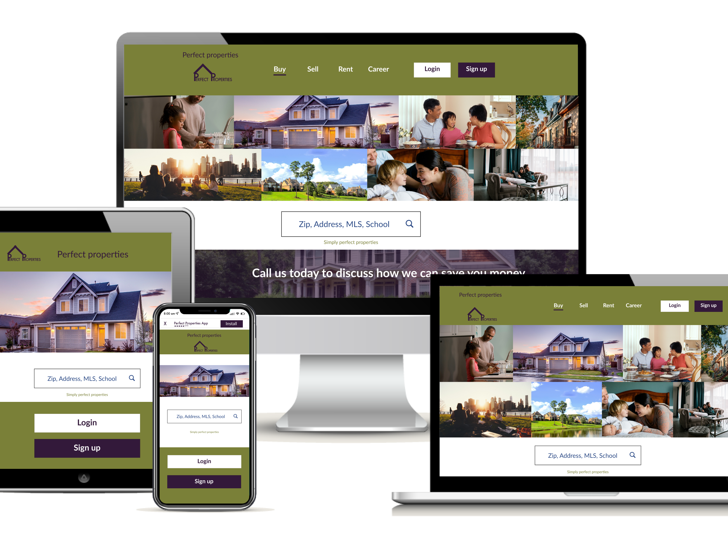
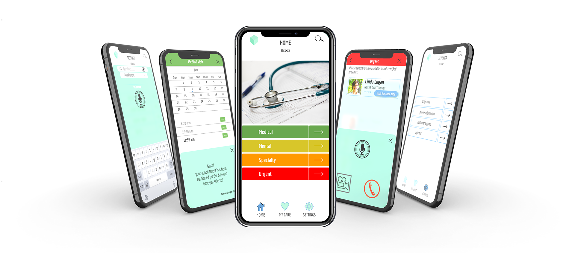
High fidelity mockups can be seen below.
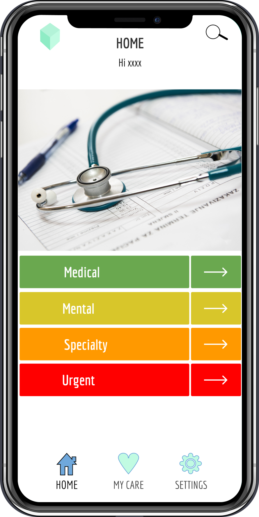
Home screen -
Allows users to conduct functions like search, navigate to Settings or My care page. Specific categories of service, namely Medical, Mental, Specialty and Urgent care are evident on the home screen.
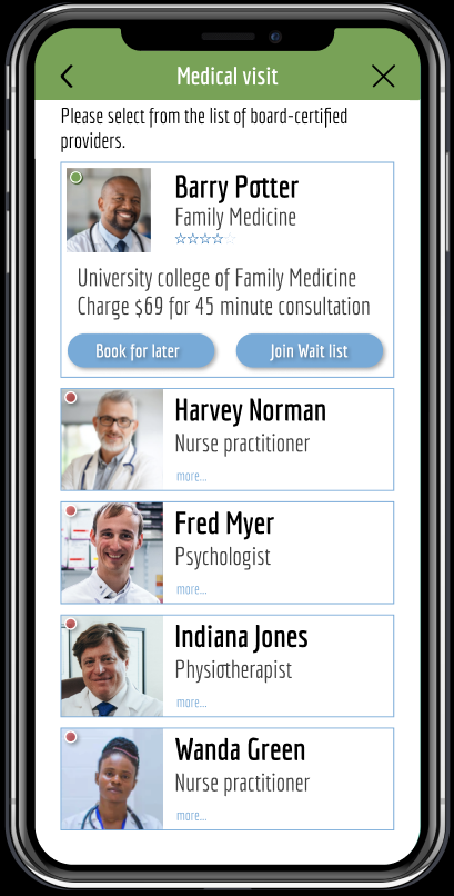
Medical visit screen -
Mockup has a scroll narrative that shows all providers along with availability, name, rating and speciality area. The users are able to choose between booking a call for later or placing an instant call.
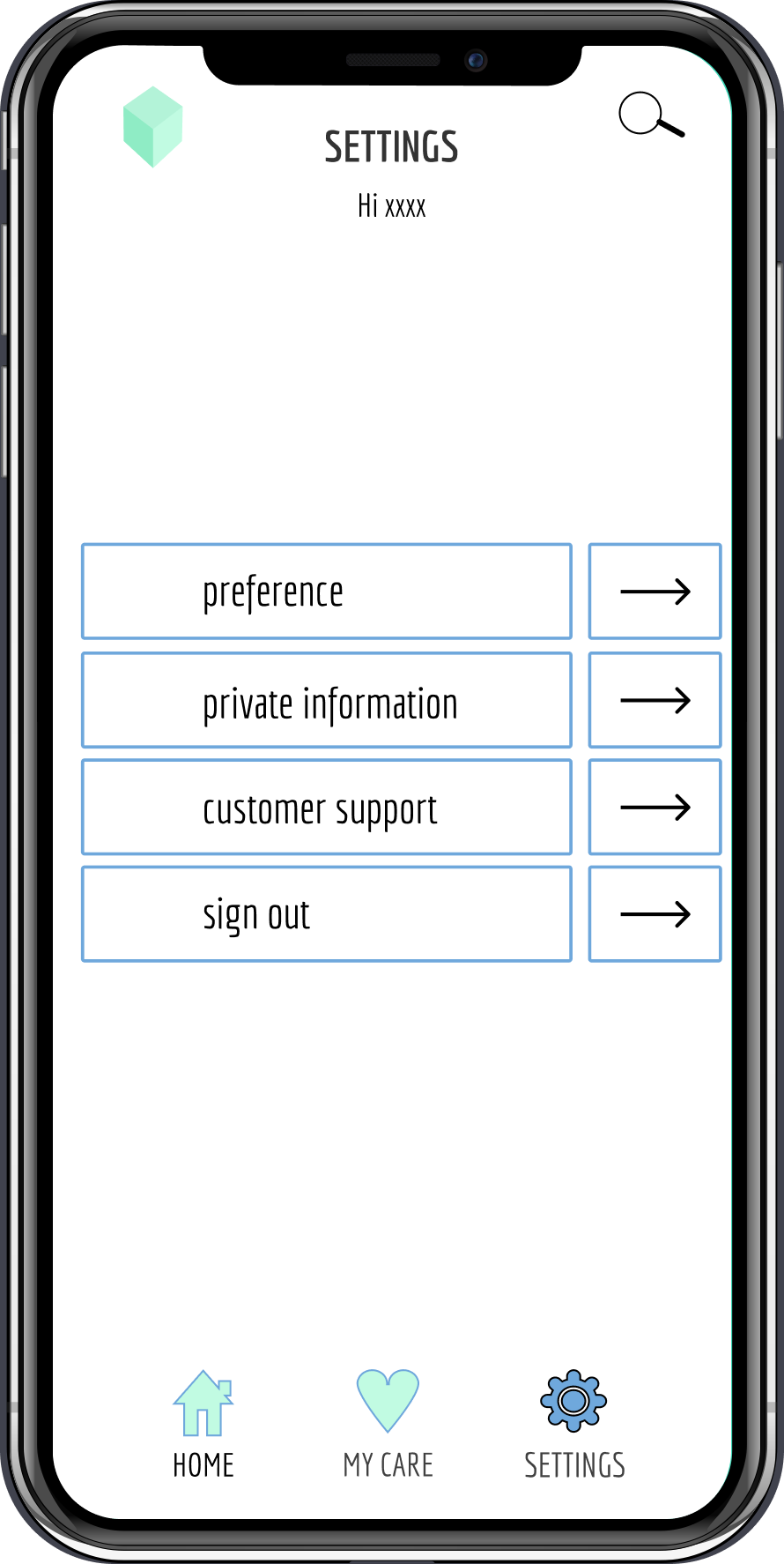
Settings screen -
Users can access their preferences, customer support, sign out or their personal information like credit card details, medical records etc.
Interactive prototype created on Figma
Video presentation of the app
End-to-end design
Result:
The end-to-end design of SeeMD aligned with the Business Requirement Document (BRD). As the problem statement identified the requirement of building user trust, subsequently, the style guide and design system re-enforced this in the tone of voice, colors and language used. Additionally the content displayed evolved in partnership with user testing using images and carefully architected information that aided users to be partners in an enhanced user experience.
Challenges:
- I used Keynote initially to create my High-Fidelity Wireframes & Clickable Prototypes. But the peer feedback I got was that some of them were unable to open it because of the limitations of the iCloud. For instance, one person said, "I cannot open it - it's requiring me to upgrade my account. This is not the best option since only Apple ID users can open it - plus there are hidden upgrades/costs required. Use standard prototyping tools..." Though I was initially frustrated but I accepted the fact that this was a major error on my part. But it provided me an opportunity to explore Figma, a free wireframe and prototyping tool that is accessible across all browser types.
- Feedback obtained can also be non-constructive, and can require push-back. For example, on sending a design for approval, I once received criticism for the choice of text color on a dark background but when I sent my rationale my color choice was accepted. I sent screenshots showing how I had run my choices through the test of accessibility per the Web Content Accessibility Guidelines WCAG 2.1 and my color choices had passed on all text sizes.
- Time management can be severely affected if there are unexpected technological failures. This situation arose for me while I had set up a virtual interview and my laptop was not responding. I had to re-schedule the interview, and now, I try to be better prepared using foresight to keep a backup option.
Reflections:
The pandemic highlighted technological dependencies. User research and testing, though possible virtually, in my opinion would be better served with in-person interaction. That's primarily because 'doing' differs from 'thinking' and 'speaking' of tasks. This was my first experience of an end-to-end design project, I thoroughly enjoyed wearing many hats, from being the UX researcher, to the UI designer and UX designer.