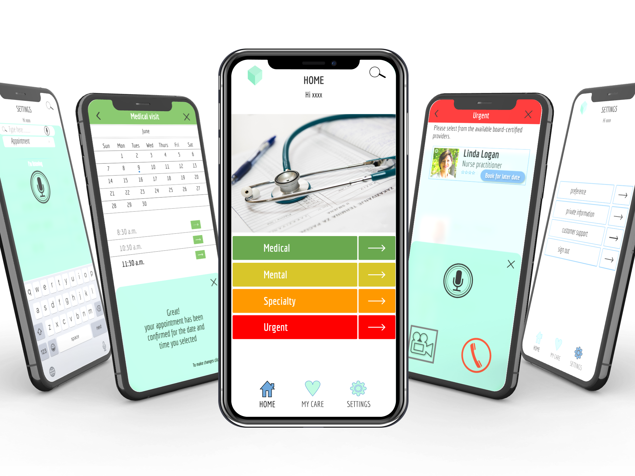
Problem to solve for is: Make golf more equitable for people where golf coaching isn't easily accessible.
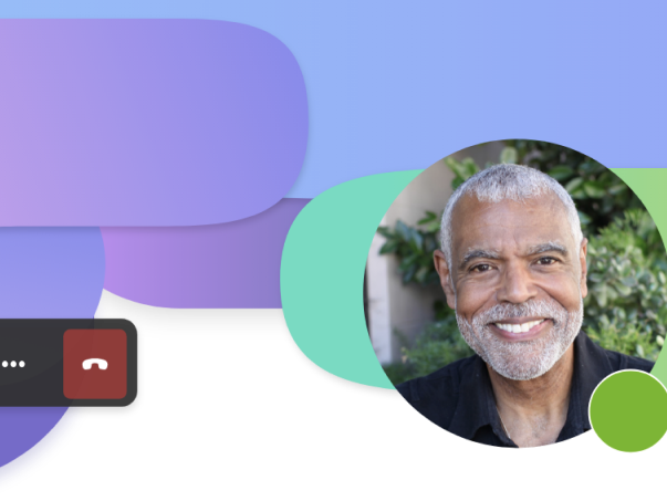
Hypothesis: Creating an app where thousands of professional golf coaches are available online to provide live feedback using current technology to help improve swing, stance and follow through will make golf more equitable for users.
Looking at a snapshot view of the behind-the-scenes process:
1) UNDERSTANDING THE PROBLEM
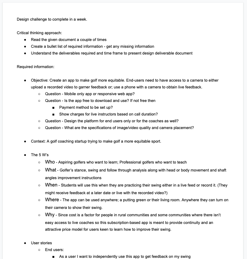
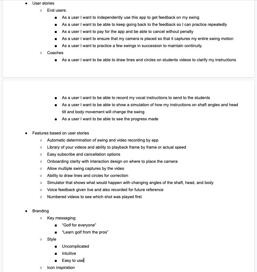
Putting together a business requirement document with the key points. This included the objective of the app, questions to be asked for further clarity, the 5 W's (Who, What, When, Where and Why) and high level user stories. First two images show these initial stages of the process.
2) SECONDARY RESEARCH
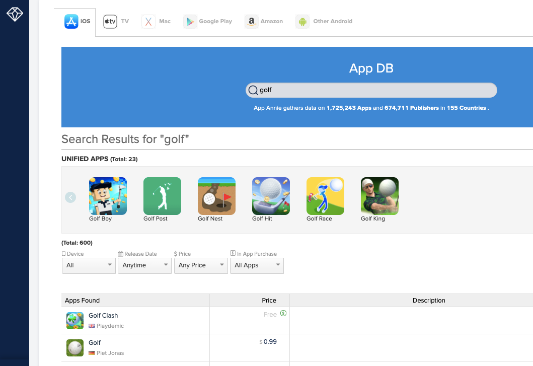
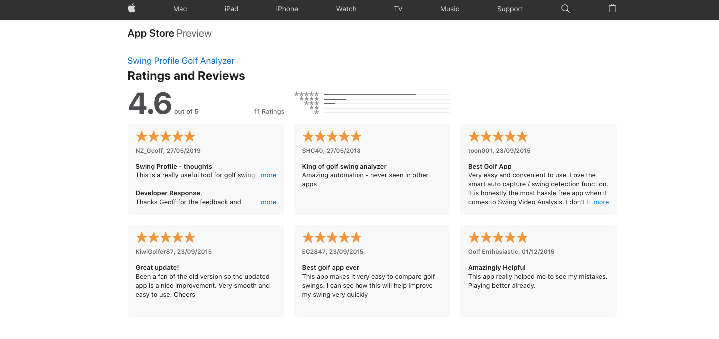
Next, I studied the existing competition using App Annie and reviewed comments by current users for some of the apps. This guided the question formation for my secondary research.
3) SWOT ANALYSIS OF THE COMPETITORS
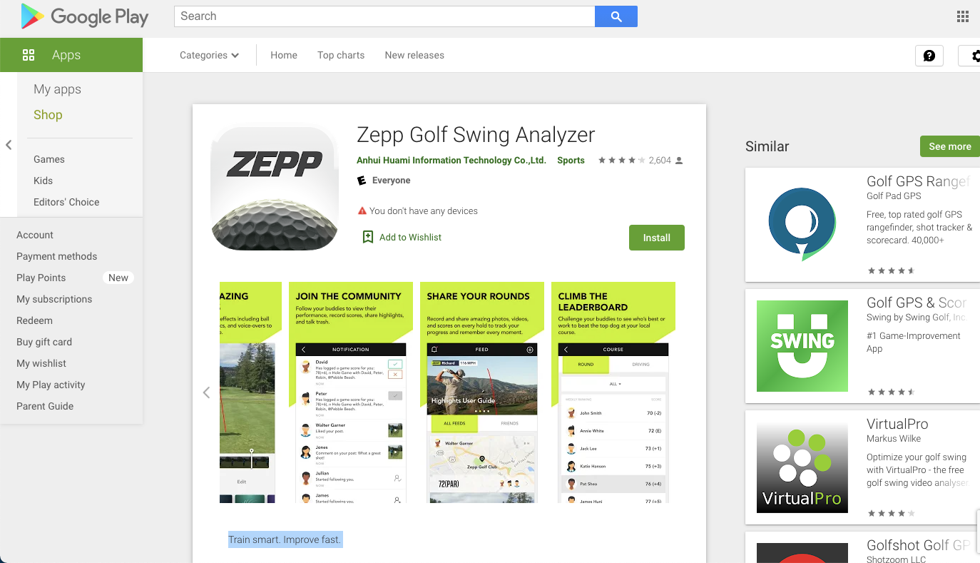
I used the Google play store and the Apple app store to do a UI and SWOT (Strength, Weakness, Opportunity, Threat) analysis of a few of the competitor apps.
Conducting competitor analysis
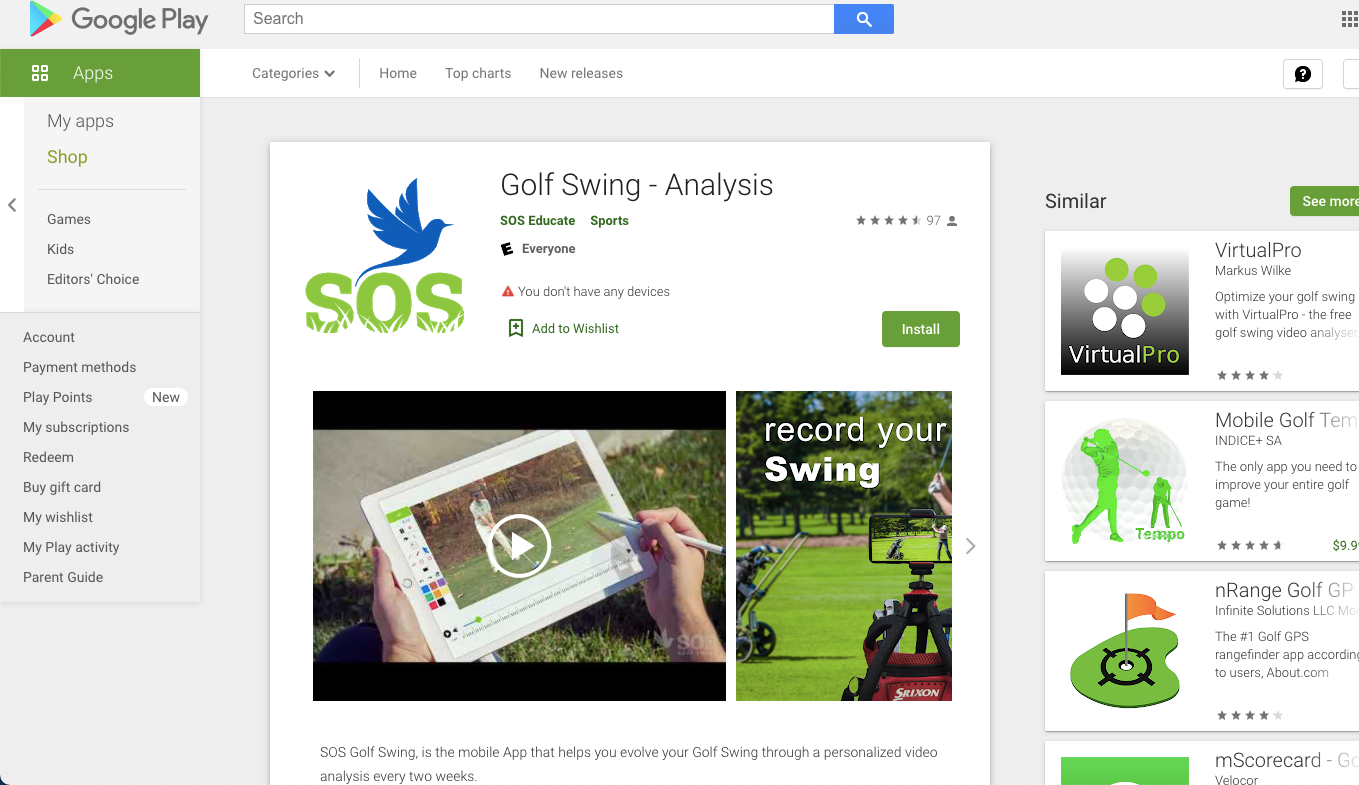
Checking apps on Google Play
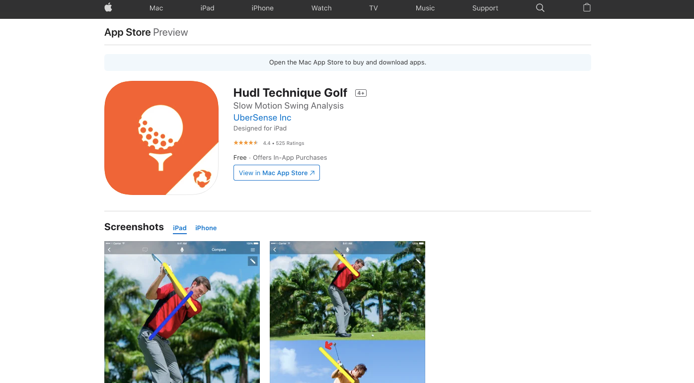
Checking apps on the Apple store
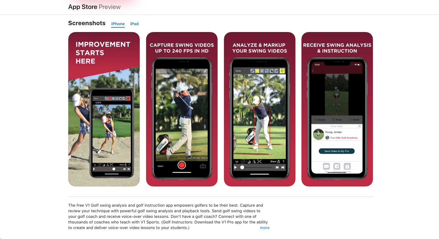
Competitor SWOT (Strength, Weakness, Opportunities, Threats)
4) USER SURVEYS
I created a survey asking questions to better understand user pain points, motivations, goals and get a better understanding of the user demographic.
6) USER FLOWS
Interaction of the user with the app from start to achieving the desired results is shown in these user flows. Here we are looking at the onboarding user flow. To see how the user successfully completes the process once the app is downloaded to creating an account. We are also looking at the user flow when the end-user has to complete the task of sharing a video with the golf coach. Lastly, we look at how the golf coach would provide feedback when a student/golfer's video is received.
7) SITE MAP
The information required for the app is organized according to hierarchy with most important categories easily visible. The categories are subdivided to hold other important information. The site map shows how the information is organized for the end-user/learner and the golf coach.
8) LOW FIDELITY WIREFRAMES
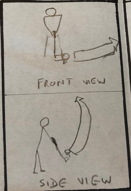
A quick sketch of the screen options for onboarding, videos and coach views
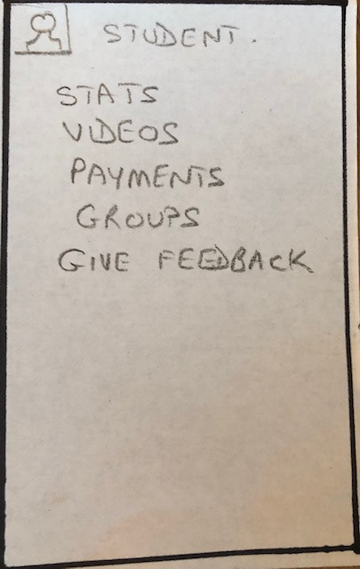
Coach view of Home Screen
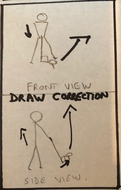
Coach draws corrections
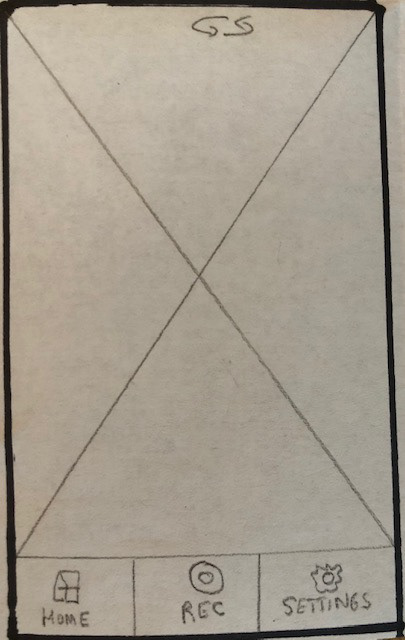
Option 1 of user Home Screen
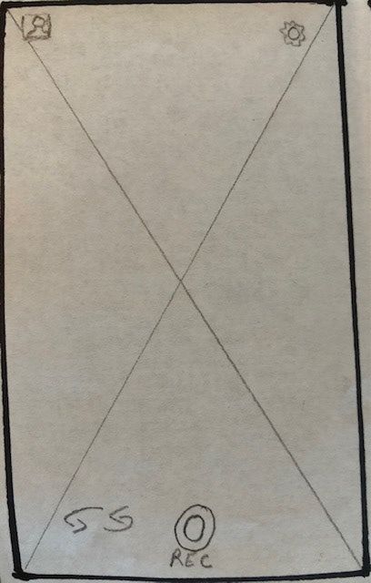
Option 2 of user Home Screen
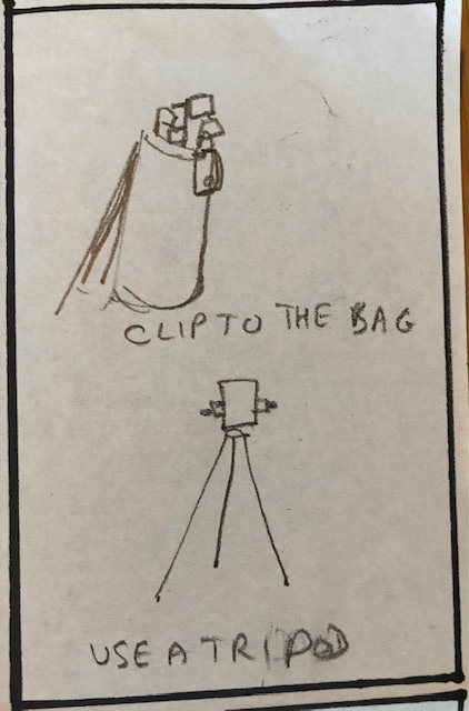
Tutorial - how to place phone camera
Tutorial - videos to send to coach
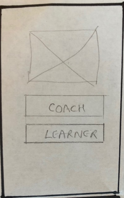
Option 1 of onboarding screen
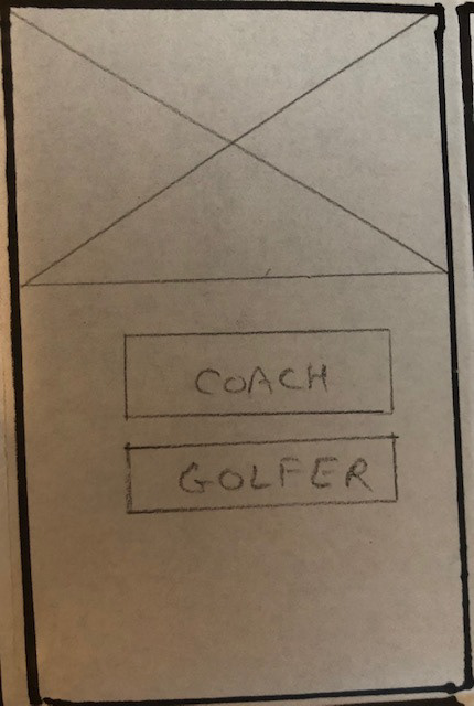
Option 2 of onboarding screen
9) MID FIDELITY WIREFRAMES
Wireframes for the golf app. The iterations shown are for the splash screen. The first one is incomplete as it is missing the log in button. It also assumes Sign up which might not get any clicks. The second iteration provides login option for people with existing accounts. The second box asks a question which is easily answered and will bring users to the next onboarding screen.

ITERATION 1 OF SPLASH SCREEN

ITERATION 2 OF SPLASH SCREEN
MID FIDELITY WIREFRAME OPTIONS
Onboarding screen options for coaches
The first is a single screen text option
MID FIDELITY WIREFRAME OPTIONS
Onboarding screen options for coaches
The second option is multiple screen image and text option
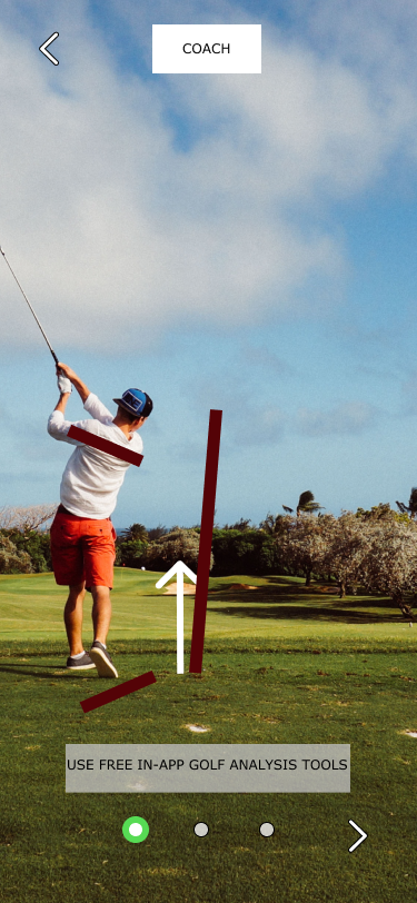
Using golf analysis tools
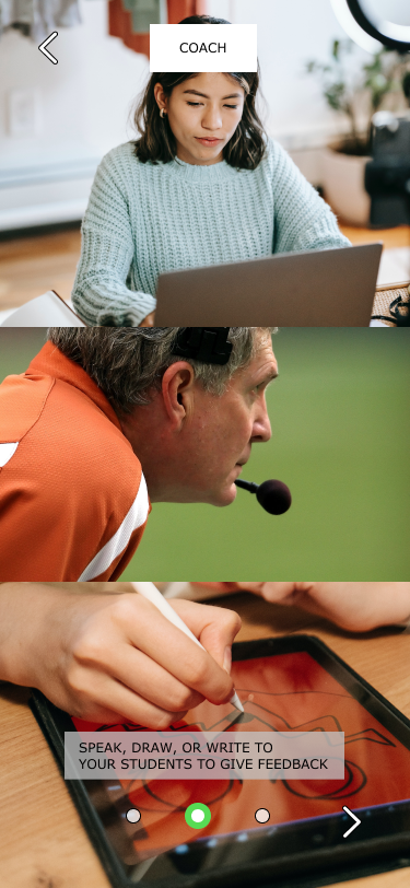
Speaking, drawing, or writing to give feedback
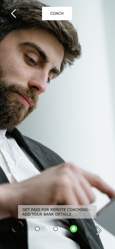
Adding bank account details

Final sign up screen
MID FIDELITY WIREFRAME OPTIONS
Onboarding screen options for golfers
The first is a single screen text option
MID FIDELITY WIREFRAME OPTIONS
Onboarding screen options for golfers
The second option is multiple screen image and text option
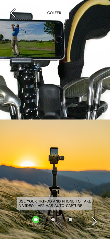
Fix camera as you like
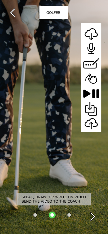
Edit and enhance your videos to share
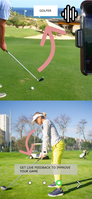
Receive live feedback

