Problem statement
Design the dashboard for a COVID-19 tracker app to be used by epidemiologists and health care professionals.
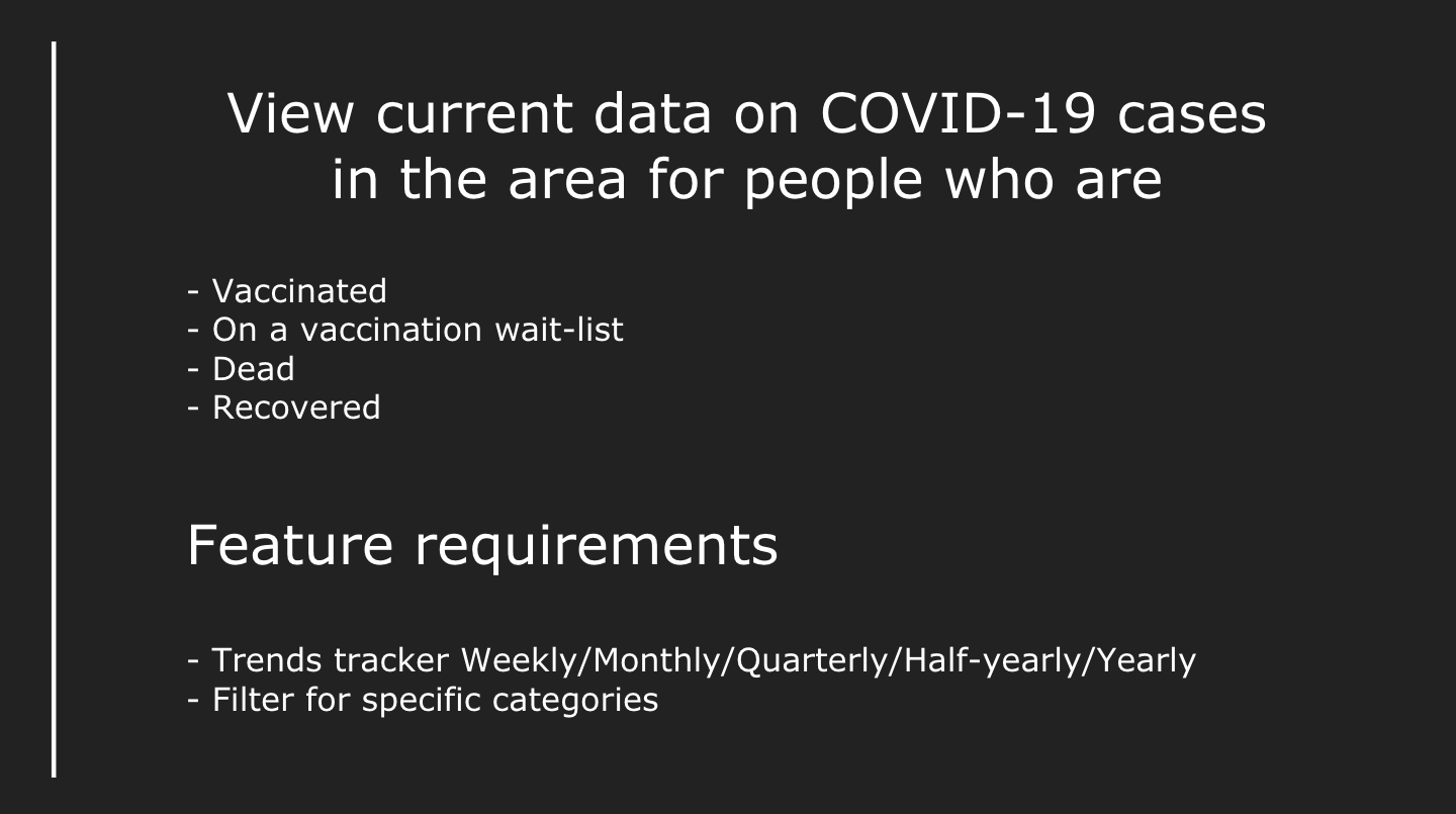
Business Requirement Document BRD
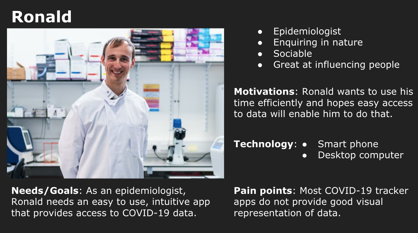
User Persona
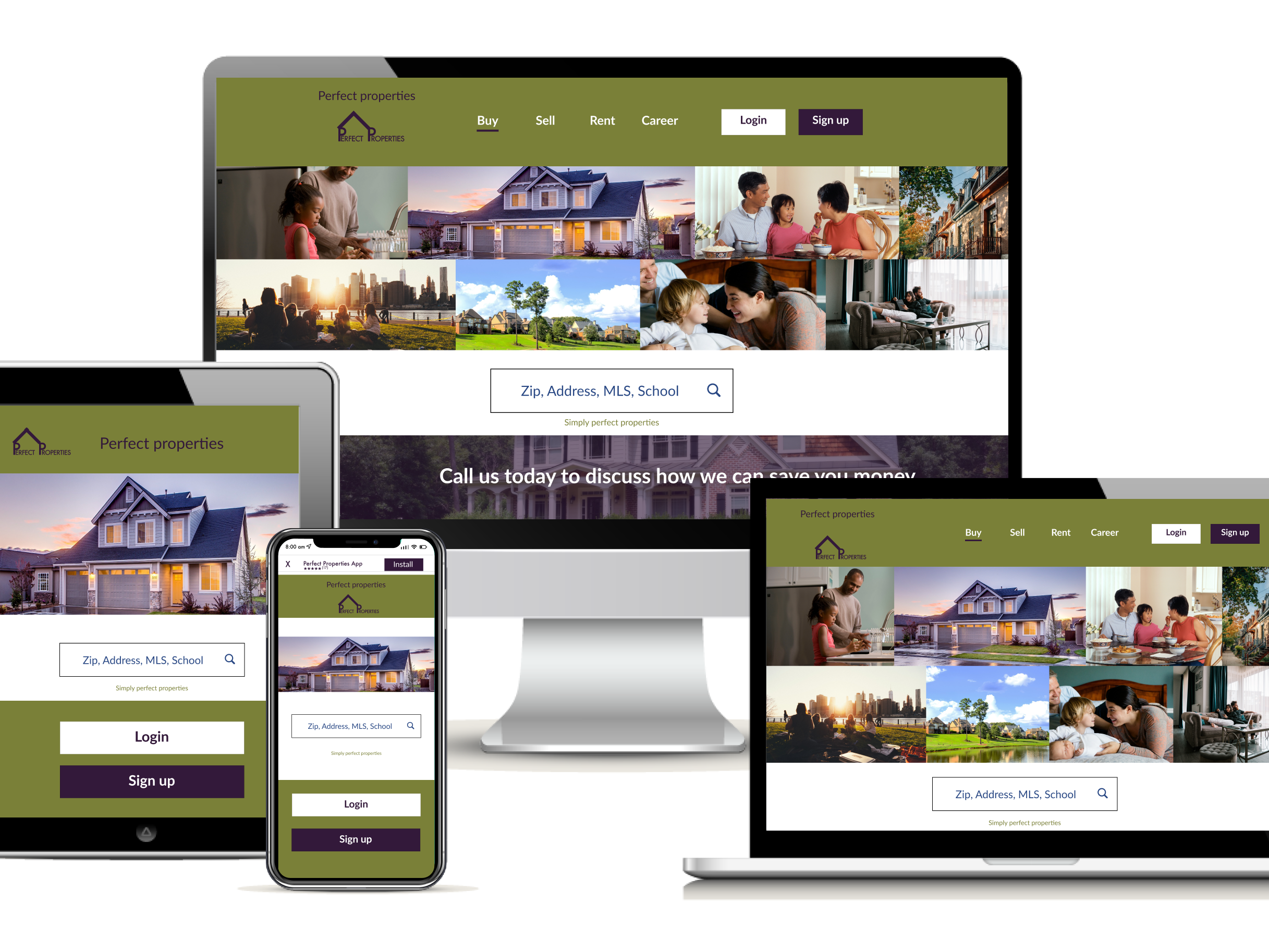
Logo
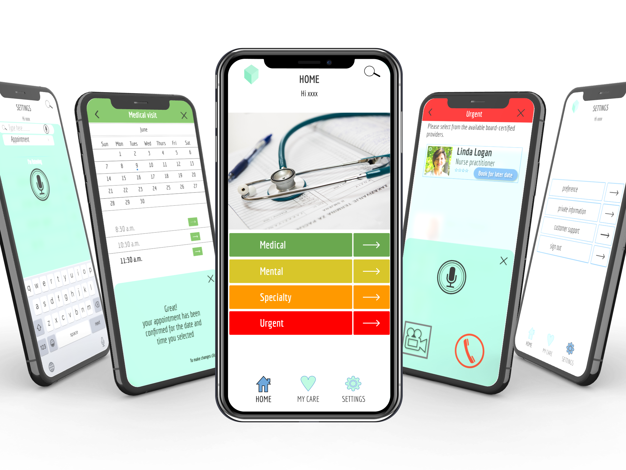
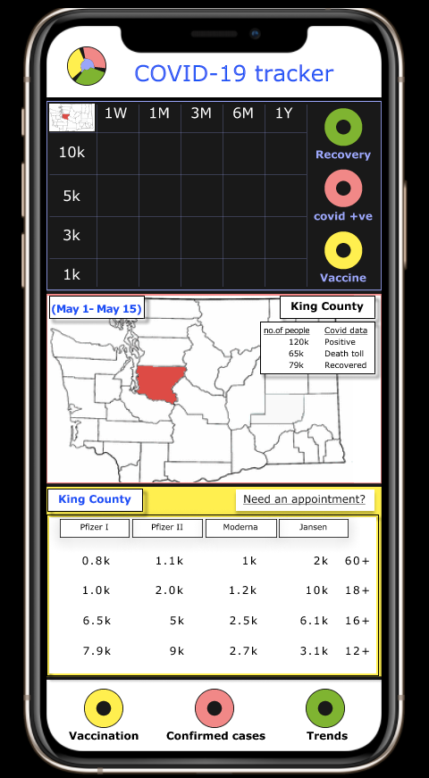
The Dashboard
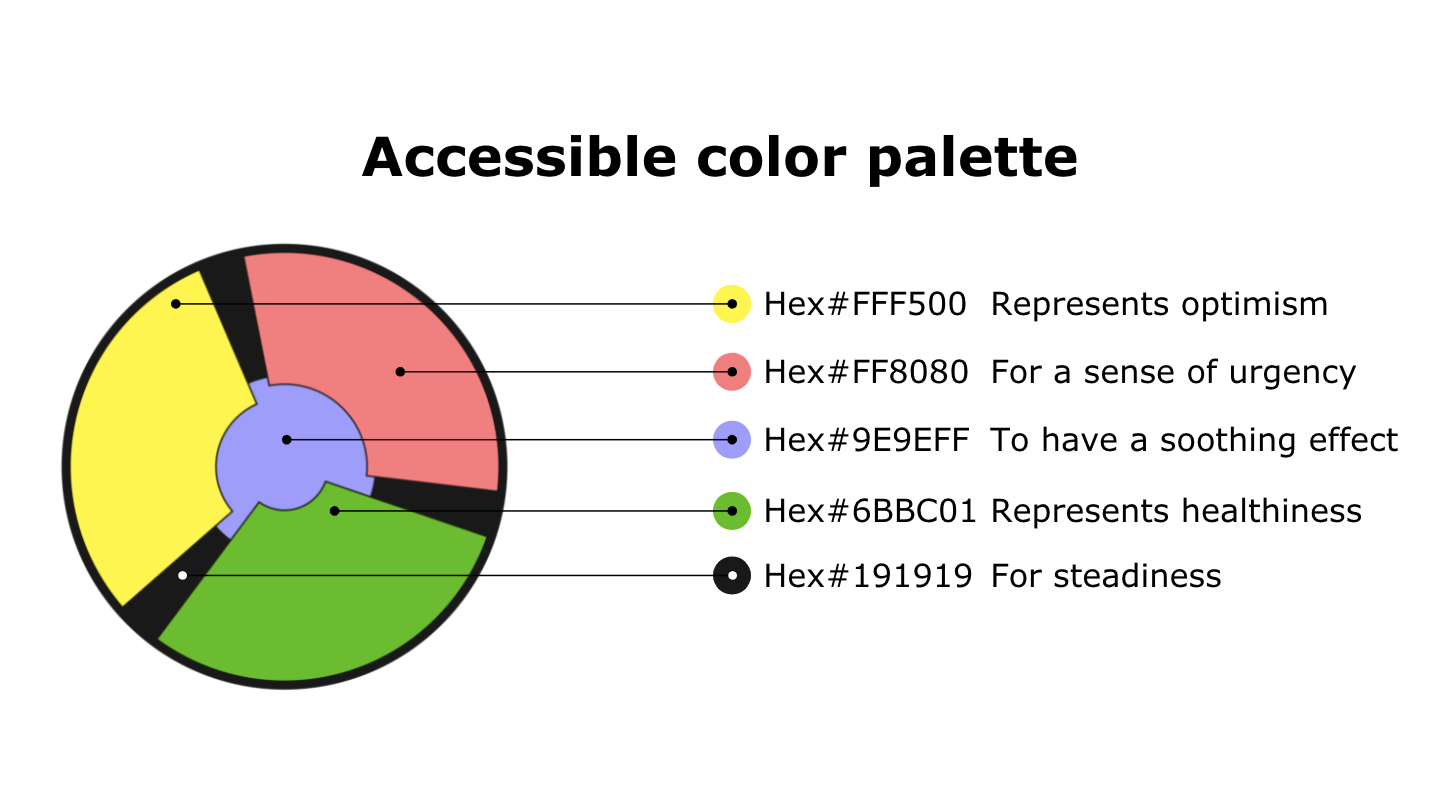
Here you can see how the colors have been used to signify the various data displayed here.
Green is for the trends and also to show recovery.
Red is for Covid-19 cases
Yellow is for the vaccination data.
Interactive Prototype
Video Presentation